The Wes Anderson Typeface: Futura
- Constanza Coscia
- Jul 2, 2018
- 2 min read
Written by: Constanza Coscia

It’s become a joke in class that I am the queen of the typeface Futura. In every project we have, if I can use Futura, I will use it. It is such a classic typeface- clean and polished and applicable in almost any situation. But what is its history?
The YouTube channel Vox made an interesting video detailing the typeface’s history, from its modern day use to its history with the Nazi party in Germany.
The typeface was designed by Paul Renner and was released in 1927, in a time where the Bauhaus school was reigning supreme over the design style of pretty much everything. Geometric, clean, and polished, the Futura typeface was supposed to express modern ideals. Renner was against the idea that modern design should honor or revive the style of previous decades.
When World War II started, the Nazis had taken over Germany. They were against typefaces like Futura because they represented a new, modern Germany- exactly what the Nazi party was against. The Nazis were holding onto old school German typefaces, ones that reminded people of the greatness of the Germany of the past. Renner was exiled; he was so against the Nazi party that he even published an essay against them.
By then, Futura was travelling overseas to the United States and other important parties. The US adopted the typeface almost immediately as it was very easy to read, and so they would use it on manuals and brochures.
Mid-war, the Germans decide that those “old-school, great German fonts” were Jewish, and so those were forbidden. That’s when Futura is adopted by the Nazi party, and starts being used in their manuals and brochures for the war.
Then, the war is over, and Futura has to escape the association with the Nazis. Fortunately, it already had. Because it had travelled internationally even before the Germans had adopted it, it was being used over seas. And so, come the 1960s, Futura was even being used in the Apollo NASA mission in the use, proving truly that it was a Futuristic font.
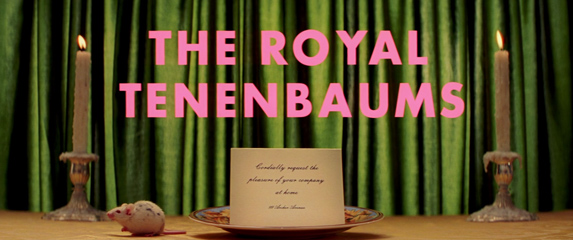
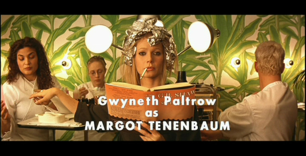
Nowadays, the font is used all over the world, giving off a vibe of modernism and polished pride no other font can achieve. Mostly, Futura can be seen in Wes Anderson films, so much so that its become a cliché to complain about it being a cliché.
References-
https://www.youtube.com/watch?v=SaX_PwxSh5M


Comments